Building Responsive Layouts
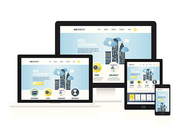
In today’s competitive online world, having a responsive website design is no longer optional — it’s a requirement. A responsive layout ensures your website automatically adjusts and looks perfect on all devices, from large desktop monitors to small smartphone screens.
Why Responsive Design Matters
Responsive design improves user experience by making content accessible without unnecessary zooming or scrolling. This leads to increased engagement, lower bounce rates, and better SEO performance. Search engines like Google prioritize mobile-friendly sites in search rankings.
Core Principles of Responsive Design
To build a truly responsive website, consider the following principles:
- Use a flexible grid system that adapts to different screen sizes.
- Implement responsive images that resize or crop based on device width.
- Utilize media queries in CSS for targeted style adjustments.
- Prioritize mobile-first development for faster load times and better performance.
Tools and Frameworks
Frameworks like Bootstrap and Tailwind CSS provide pre-built responsive classes that save development time. However, understanding the underlying CSS concepts allows you to create customized layouts beyond standard templates.
Testing Your Layout
Testing across devices is crucial. Use browser developer tools to simulate various screen sizes and orientations. Services like BrowserStack and Responsinator can also help test your site on actual devices.
By following best practices and regularly testing your website’s performance, you can ensure a smooth and consistent experience for users — no matter what device they use.
← Back to Blogs